Key Information
A client project
Role Responsibility
Tools Used
Research Plan
Interview Scripts
Heuristic Evaluation
Questionnaire Design
Affinity Mapping
User Interview
Data Collection & Analysis
Miro
Google Form
Google Docs
Microsoft Excel
Figma
Abstract
Purpose of Design Project
The client is a startup that hadn’t previously worked with UX designers on their website. They were curious to see what could be improved to create a better experience for their online customers. While they wanted to keep some of their original aesthetic choices—like the handwritten notes under product images—they were open to refining the site’s overall usability. The project offered a valuable opportunity to refine the site’s structure and evaluate how clearer navigation could influence customer engagement
Methodology
The project followed a user-centred design process that included heuristic evaluation using Nielsen’s principles, user interviews, comparative analysis, usability testing, and questionnaires. Key deliverables included redesigned wireframes for the product and merchandise detail pages, along with user flows and task flows that helped clarify layout structure, content hierarchy, and interaction feedback
Key Takeaway
At the heart of every effective UX design is a satisfied user, and in e-commerce, that satisfaction directly drives business growth. The result was not just a cleaner interface, but a more confident shopping experience that aligned with the brand’s goal to grow, leading to a 27% increase in conversions and stronger engagement from first-time visitors
The Problem Space
Any startup company may require an evaluation of its business space, product, or service to create the best and most unique experiences for its users. The challenge Horizon Track Club was facing was a lack of information on customer experience
Horizon Track Club is a marketing and branding agency with the goal of elevating the support given to Canadian elite-level athletes through our profit-sharing model. It sponsors Canada's best middle-distance track and field running team, made of current and former Simon Fraser University athletes and alumni
The Goal
How might we outline challenges in which to achieve success to enhance user engagement and elevate their overall website experience?
The Research Plan
Empathize - Client
Horizon Track Club is an athletic lifestyle brand that provides a retro feel to its members. At present, they have six interactive pages, including - one main introductory page; one merchandise page Shop All, with the purpose of making a profit; and four informative pages called New Balance Joins The Chase, Our Mission, Cam's Story, and About Us to introduce new and existing customers to the brand, its community, the mission they are working towards, and current collaborations of merchandise products.
The client is looking to introduce new clothing collections and expand its client base by adding a page on its website for the latest brand updates. When making the website, it used the built-in features in the website builder without consulting with UX designers. Therefore, it looked forward to learning about possible challenges users incur when navigating its product page before launching the new collection.
Identify Possible Problems
Heuristic Evaluation
At first, to highlight possible areas of improvement on the Shop All page, I decided to run a heuristic evaluation. I carefully reviewed the interface and compared its content to 10 Nielsen usability principles. I have used Excel to write the problem, its description, and its severity. The severity rating starts from 0 (not a problem at all) to 4 (must be fixed immediately). With the group consensus, we highlighted 3 heuristic types that were the most common. The analysis helped me to select appropriate design introductions for each highlighted area.
Then, with the team, we verbally outlined issues that we would be able to work with, as they do not require coding to fix (such as problems with double navbar and button jumps) and are most likely to have a major impact on user satisfaction with interface usage. It was crucial for me to align usability research outcomes with the client's expectations, so I paid attention to the type of data collected. For better representation, some team members were working on redesigning the page to address changes visually.
Define Evaluation
I've reached out to the client to gather insights into their existing and target customer base to gain a better understanding of who to recruit and how to design tests tailored to their needs
Comparative usability testing
helped me to observe how users interact with various elements on the website and how it can affect their engagement with the product and a page
Questionnaires
I used it as a statistical analysis for the client, offering quantifiable insights highlighting trends and patterns and previous customers' experiences and expectations.
Think-Aloud
some elements of this method were used to write down reactions, thoughts and comments
Ideate
To better understand user experience architecture when making simple purchases, I have created User Flow.
Due to project time limitations, I had to focus on areas that would be used the most on the website and may not be optimized for a seamless navigation experience
In the blue area, it is visible that the user has to do extra steps to learn more about size guides, as they are placed differently for each product and may not be complete. In addition, it is not clear right away what sizes are available and which are out of stock if not selected. Purchase interaction is also unclear, as the user can only check the shopping cart when the message of an item added appears
Task Flows
After designing the user flow, I worked on creating a task flows that would cover all areas for improvement
The tasks are constructed to make participants go to the main menu and skim through multiple available products to choose 2, use multiple buttons for size, use functions like adding to cart, return to the previous page, and check the sizing guide. In addition, the placement of the objects the user has to interact with in the task was strategic to make participants check available elements in the given interactions
The first task was simple: to see how easily a user is able to navigate through available features and interact with them
The second task aimed to see how the information hierarchy affected the decision-making of the user
How easily can they access different information throughout the product page?
How easily can they access different information throughout the product page?
The last task is short but very important, as in the original website, users were locked from viewing added items as well, and the message bar indicating the item was added to the cart had low visibility
The next step was to work on questionnaires that would play a significant role in learning more about users' needs and wants. I worked on a pre-questionnaire to learn about their preferences and past experiences with online shopping. Then, I designed Questionnaires for Design-A (the original website with the original user flow) and Design-B (a mock-up product page with possible solutions) with open and closed-ended questions covering all areas of concern. Lastly, I created a comparative post-questionnaire to compare how impactful those changes were to the user
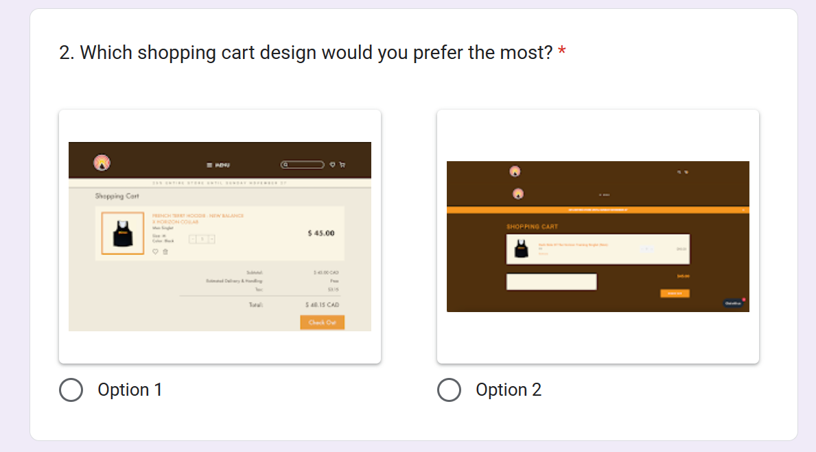
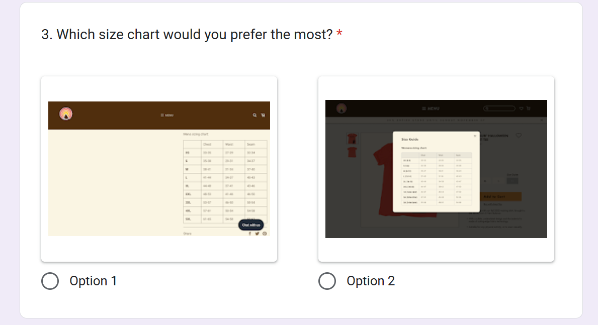
This is an example of a question about the satisfaction product page hierarchy. The left image is for Questionnaire-A, and the right is for Questionnaire-B
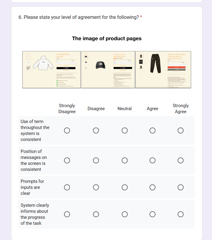
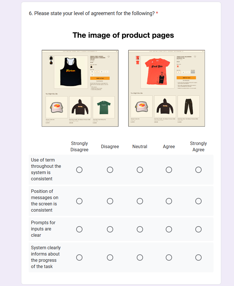
Example of Post-Comparative Questionnaire
The questionnaire is built in a way that users are not able to determine from which interface the screenshot is taken, as well as they are randomly placed in each question to ensure the validity of the answers; validity that some participants do not just pick one side and select it without thinking about the design again
Test
Before the test, it was important to ensure that comparative usability testing was going smoothly, create a comfortable atmosphere for the participants, and respect their time by making the test short and having breaks between tasks.
It will also help to ensure the results are reliable and valid.
Therefore, before the actual test, the procedure was narrowed down to 6 steps (excluding breaks) for a total of 25 minutes of tests for each participant:
Completing Pre-Questionnaire
Solve 3 tasks using Design A/B
Complete Questionnaire for A/B
Break for 5 min
Solve 3 tasks using Design B/A
Complete Questionnaire for B/A
Break for 5 min
Complete Post-Questionnaire
I have decided to run this test in person with the other designer to increase the completion rate. While one person assigns a task to the user, the other observes how the user interacts with the system and writes notes about it. The notes also include phrases that users have said through Think-Aloud
Empathize - User
To ensure a comfortable and practical testing experience, I ran pilot tests to find the optimal time for the break, allowing participants to refresh their minds and maintain focus. Additionally, I incorporated Motivations & Barriers into the questionnaires to assess whether the new design successfully meets user needs.
For the usability test, I collaborated with another designer (designer 2) to observe and document user interactions, tracking how participants engaged with interface elements, their thought processes, and their verbalized intentions when completing tasks.
Since the client requested testing on university students, sessions were scheduled in a quiet, private classroom to minimize distractions and ensure a controlled, noise-free and convenient environment
Data Analysis
Miro - Think-Aloud
All the comments from Think-Aloud were collected in Miro and divided into three categories: positive, negative, and neutral. This provided a lot of insightful information, and I learned aspects of the design solution that can be improved in both versions
Excel - Questionnaires
Using Excel, I was able to visually represent data to the client, mostly using columns and pie charts. I ran a t-test to measure the overall user experience (with 0 to 10 being the best experience) of 13 participants, using two tails and a paired graph. Other graphs were made to compare ratings of specific features that were previously selected in the Heuristic Evaluation
Success Criteria
Key Solution Elements
Showing selected size and colour, showing estimated cost and adding features to save items for later has increased the satisfaction rate from 4.69 points to 9.00
Selected colours will change the front picture of the product, seeing available and not available sizes as well as quickly accessing more information about sizes without the need to scroll, has increased the satisfaction rate from 5.38 to 8.73
Adding more contrast to sold-out items and prices, as well as increasing space between products, increases the satisfaction rate from 5.15 to 8.91
The data that I collected from this evaluation helped me to determine possible changes in the visual and technical features of the design
