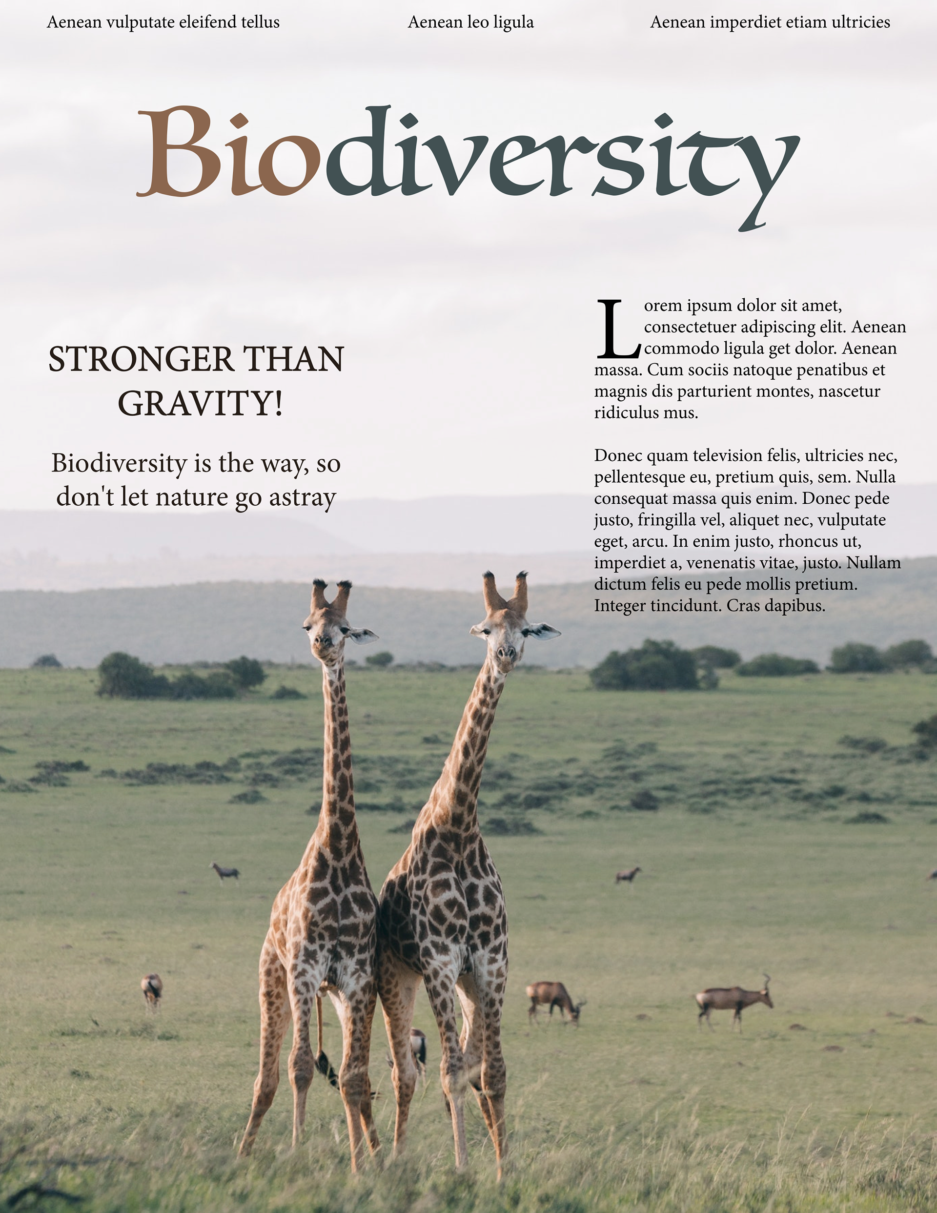
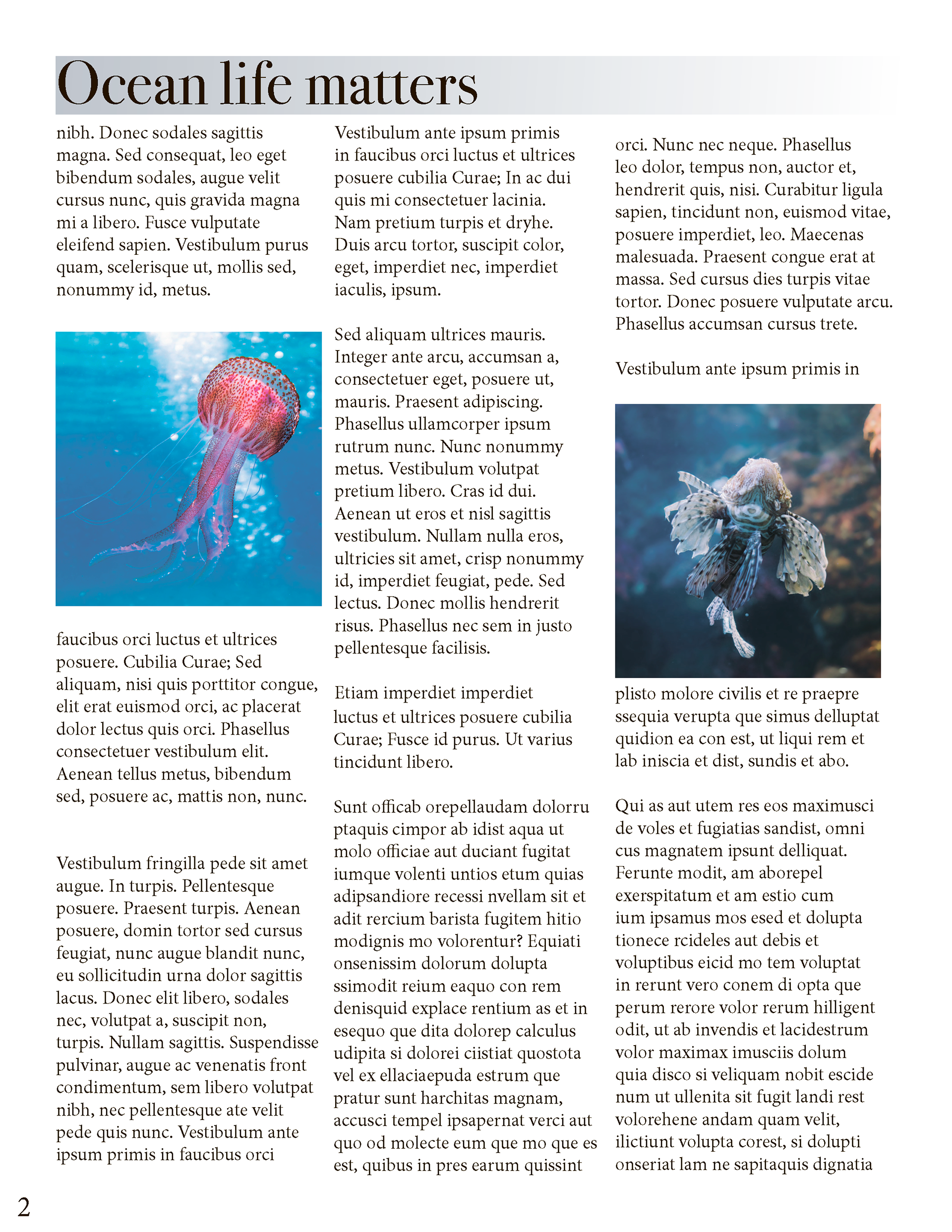
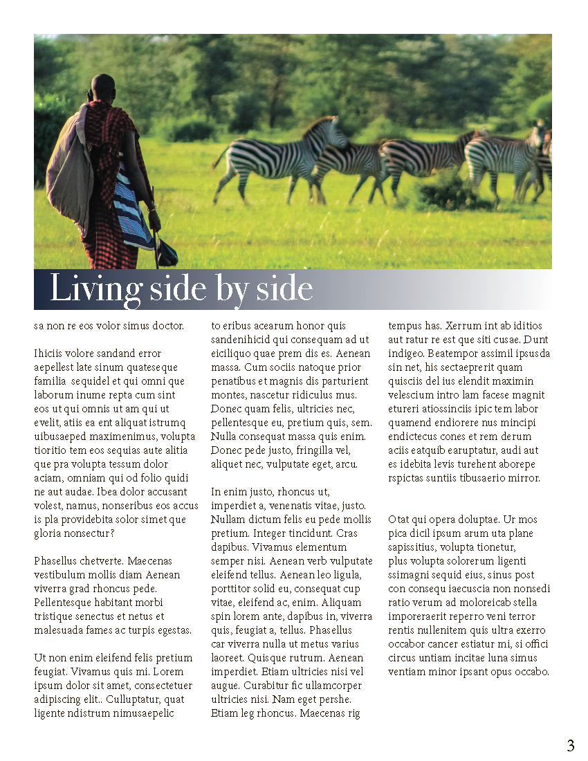
Final Outcome:


Key Information
Tools: Adobe InDesign, Adobe Photoshop
Implemented In a Group Work
Brief
In a team of three students, we were asked to design a three-page (8.5x11”) magazine article. The text was provided to us by the professor and had to be completely allocated among pages.
Process
1. All team members had to present their ideas for the magazine layout, as well as pick a main theme to address. I wanted to have a soft and colourful theme featuring nature. After some consideration team members and I decided to continue with my proposal. Before we started to work on the magazine, I come up with 2 crucial deliverables such as finalizing the title and sub-headings and choosing the best font combinations.
Title: Biodiversity
Sub-headings: Ocean life matters, Living side by side
Sub-headings: Ocean life matters, Living side by side
2. I choose 3 fonts for the magazines such as:
a) Body font - Bodoni 72
b) Headings font - Luminary
c) Folio - Herculanum
a) Body font - Bodoni 72
b) Headings font - Luminary
c) Folio - Herculanum
Decisions
1. My first decision was to set the appropriate font-size for comfortable reading - 12pt
2. In the first iteration, the magazine's main page image for the background had a strong contrast; therefore, it was hard to keep a consistent font colour, as well as to make it comfortable to read. I reduced the colour contrast of the image using Adobe Photoshop, to avoid having too many colours for fonts. However, it was still hard to read with added low-opacity text boxes and I decided to search for other available images that will suit the theme. I really liked the image with two giraffes, as it has a great colour palette and less noise.
I coloured the title by the colour scheme of the image - a light shade of brown and a darker shade of green, where bio- and -diversity had filled differently. This was made to put stress on the importance of each word. I moved the original placement of the giraffes to the left, to create a more dynamic placement and open more space for the text. I established a hierarchy to gradually move readers' attention from the title to a quick message and then to the text box.
A comparison between the first, second and final iterations
For the magazine's second page, I ensured a good line-length for readability by scaling each text box to a maximum of 70 characters per line. I decreased the size of the images, so it would be possible to fit more text and divided the page into 3 columns. I also added a page number to a magazine using the A-Master option in Adobe InDesign.
A comparison between the first iteration and the final version of the second page
On the 2nd and 3rd pages, I used threading text frames to distribute text among pages efficiently. However, in some cases, I had to individually adjust text boxes to avoid widows or orphans in the article and stairs and blocks in paragraphs.
A comparison between the first iteration and the final version of the third page
Takeaways
It was my first experience working on creating a magazine. I did not know about the rules of typography that would create easily readable content; therefore, this course helped me to significantly improve text distribution between the text blocks to maintain my reader's attention.
Collaborated with Melnichuk Mikhail, Hoque Rafi
