
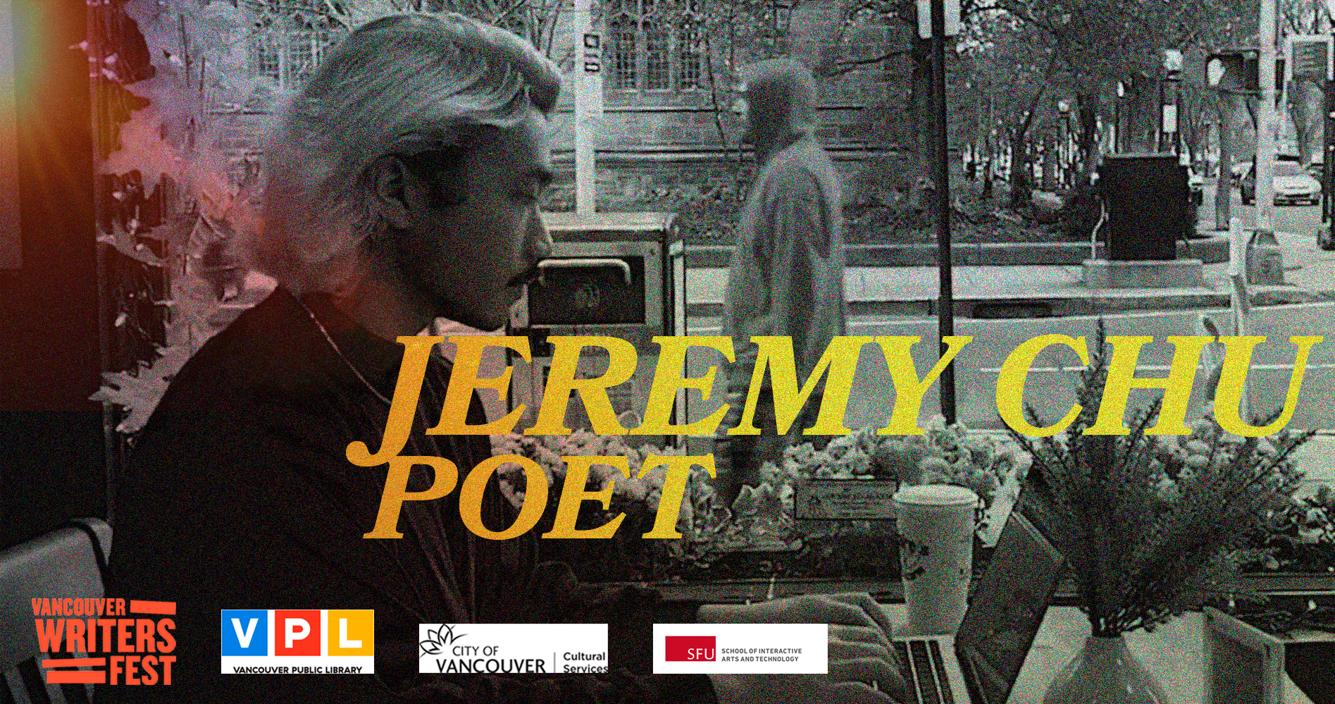
Final Outcome:


Key Information
Tools: Adobe Photoshop
Implemented in a Group Work
Role: Graphic Designer
Brief
My team and I had 6 weeks to create a visual narrative on the poem that we selected from the City Poems Content list and a response that will tell the story of the author of the poem. For the final submission, we were required to submit 3 videos that include 1. video poem 2. response 3. combined version of both. These videos were posted later on youtube and needed a thumbnail that I worked on.
The poem we chose is called "Entertainment" by Jeremy Chu.
Process
For my first ideation, I decided to look at existing thumbnails that filmmakers did for their short films on YouTube. I found out that in common, they all are quite simple - they have some meaningful snapshot that plays a major part in the story, title and awards.
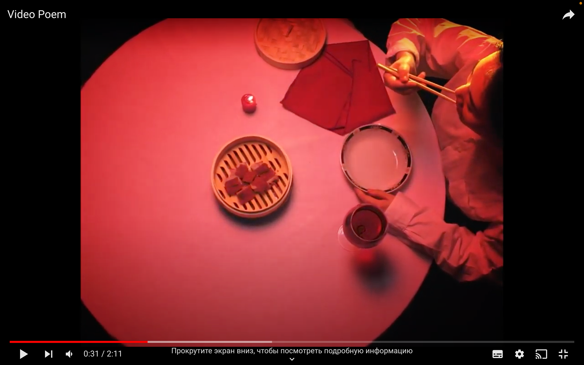
The screenshot I shared with my team shows how I would like to implement a thumbnail
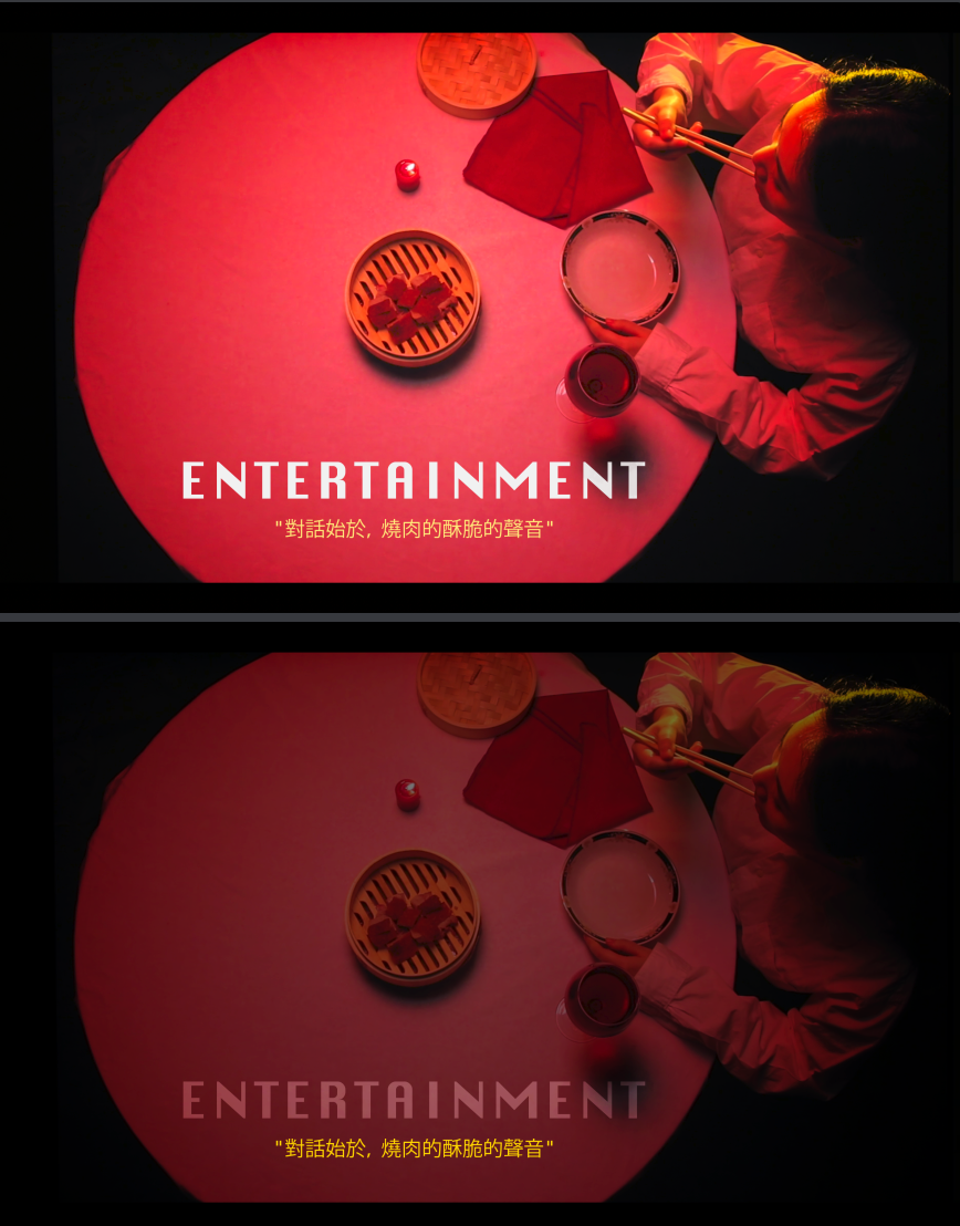
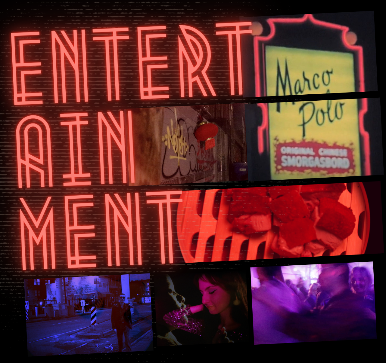
The first difficult decision I faced was to choose which snapshot to use since our video poem is heavily driven by clips. I decided to use the table snapshot since it was part of our footage, as well as it is meaningful to the poem as it is a beginning and a major turn.
The snapshot that I choose as our thumbnail
I requested my teammate to send me a high-quality image of this snapshot to work on.
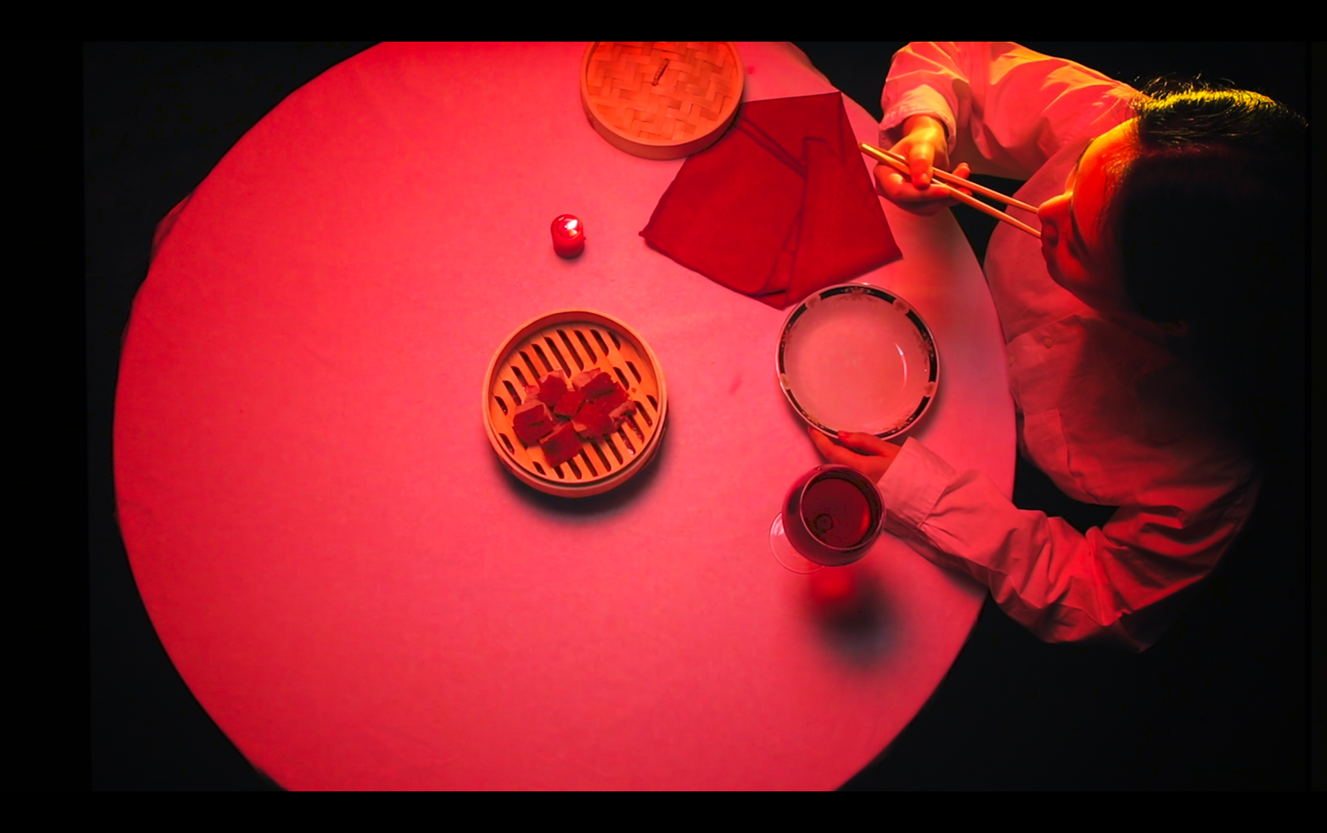
The high-quality version of a snapshot
I really liked the contrast between the table and the background, as well as how shadow and light fall on an actor's face. However, such saturated and bright colours made it more difficult in selecting where to put the title and what colour to use for the font.
First Ideations of a thumbnail - I played with decreasing colour value for better contrast with the font
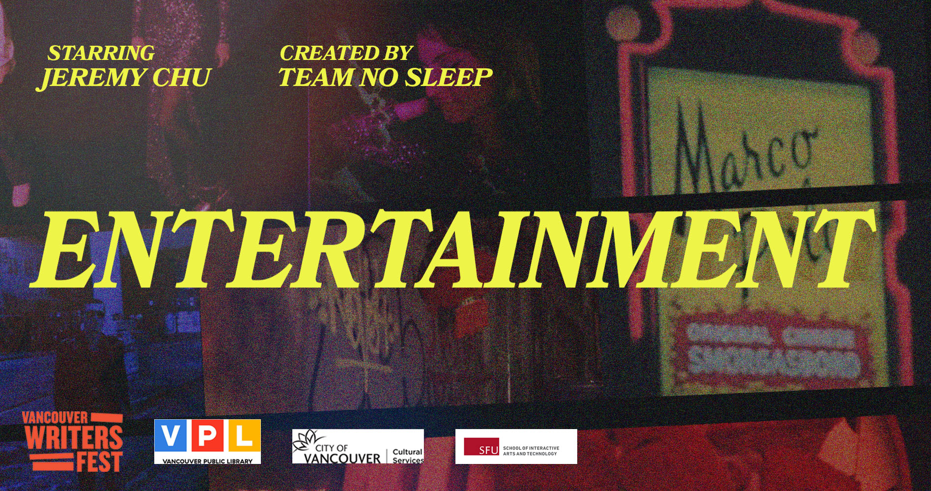
I decided to keep space on the left side to add icons or awards. However, I had to redesign this thumbnail, as my team was ideating on the font for the video, and I wanted to keep it consistent. The font that was later selected for the film and used in all future thumbnails is called BookMania. As we were wrapping up the edit for our short film, we added subtitles for both English and simple Chinese versions. The font was coloured in deep yellow, which I used in all of my thumbnails.
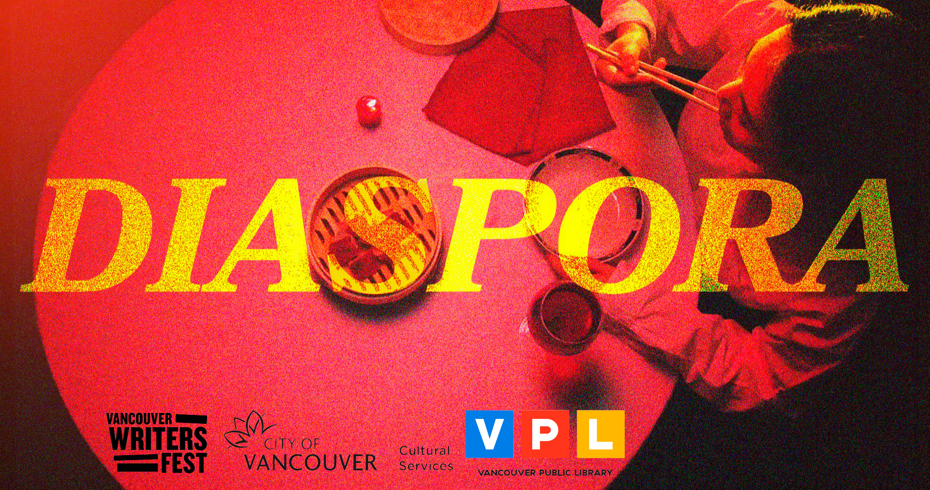
For my next ideation, we finalized the name for our combined version of the film, which is called "Diaspora"; therefore, I needed to create 3 thumbnails with 3 different styles and titles to emphasize the mood of each video.
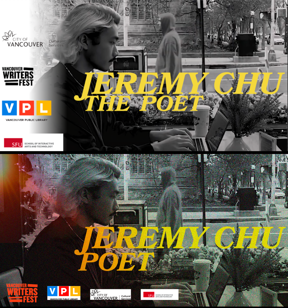
The final version of a thumbnail for our video poem
For our video poem, I decided to keep the thumbnail I worked on before. One of my teammates who was working on creating both films had a strong vision to implement the project in the aesthetics of the 70s; specifically for thumbnails, it was important to add noise and the effects of light leaks. I used Adobe Photoshop to add uniform noise and soft overlay the light leaks that I took from a YouTube video. Lastly, I added partners' logos to the thumbnail to avoid unwanted modifications.
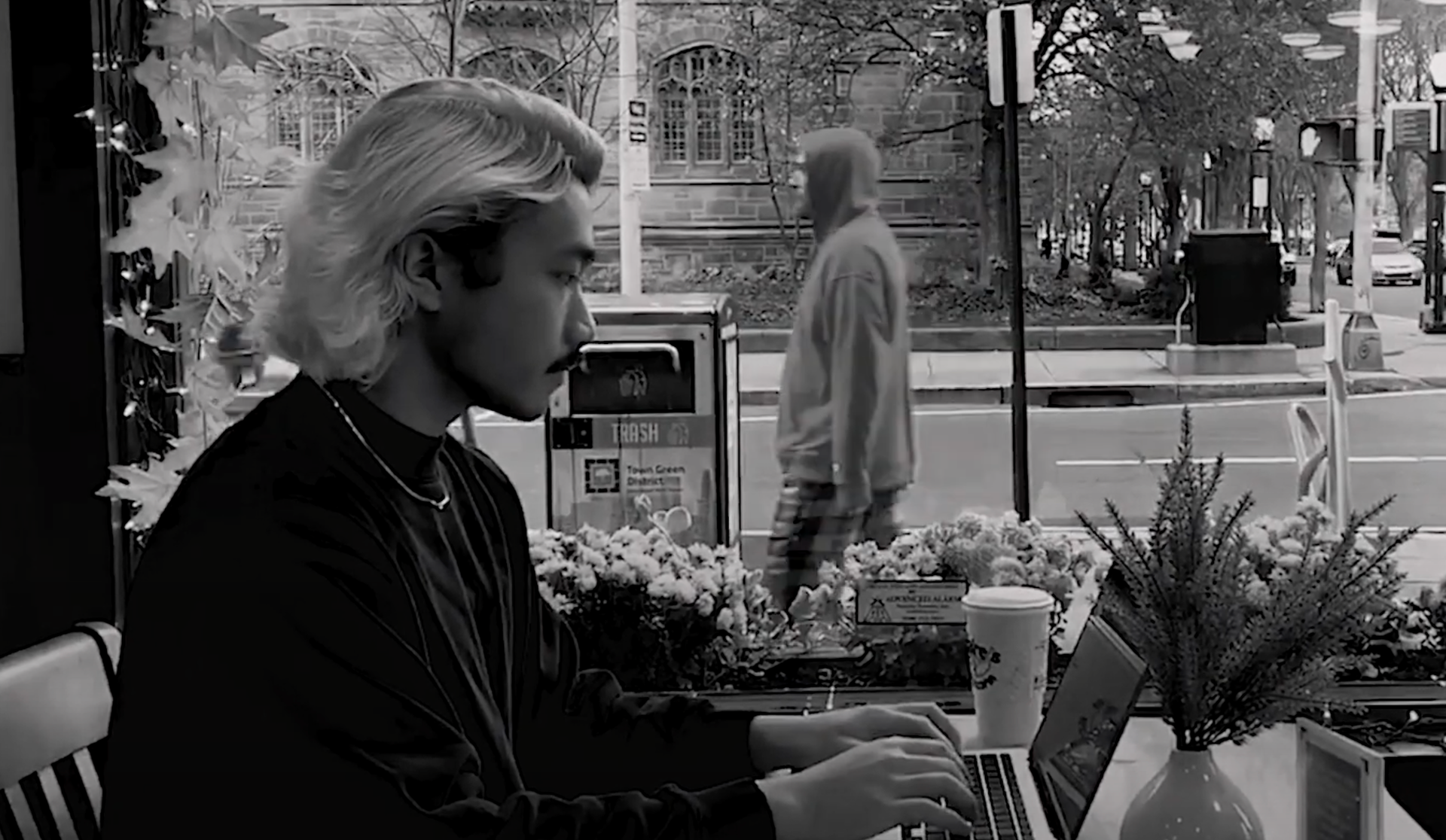
A snapshot of the B-roll video that I decided to use for a response thumbnail
Our response video features the poet and his story behind the creation of the poem called "Entertainment". Therefore I decided to make a thumbnail that will show the poet and something that directly or in-directly shows his love for writing poems. The images that we received as a B-roll were mostly his childhood images which may not be enough to tie in with the video's title. When we received the videos of Jeremy working on one of his new poems, I right away decided to use this snapshot as it fits the mood of the video. I used different types of overlay for the light leak effects - for layer 11 I used "Lighten" with an opacity of 49%, and for layer 10 I used "Multiply" with an opacity of 42% to have a beautiful shadow gradient on the title.
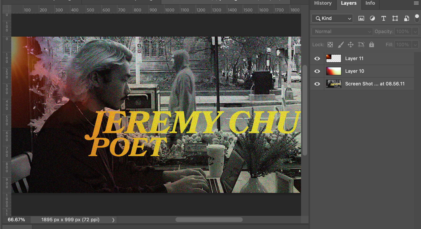
One of the ideations for the response thumbnail
However, as the background looks busy, it was hard to choose the space for the partners' logos. My first ideation was to create a gradient white rectangle on the left that would create the white space to make logos more visible. However, as a team, we decided to use a different version of logos that did not require thumbnail adjustments.
On the top: is my first iteration of the thumbnail and possible logos location. On the bottom: is finalized version
For the combined film version, I had to think of a thumbnail that would have meaning to the poem and for the response parts. At the same time, one of my teammates was working on creating a poster for the combined version of the film. She was combining snapshots from the visual novel in a very unique and beautiful way. It really inspired me, and I requested to collaborate on this part. She sent me a template that I modified by adding pictures of Jeremy.
The original part of the poster that I later modified and used in my thumbnail
In my first ideation, I wanted to see how the title and partners' logos would look on such busy backgrounds with different brightness and contrast colours.
When I added noise and light leaks, it was easier to work with the background. However, I could not use transparent versions of logos, because, without white background logos, it was hard to read.
To update the thumbnail's background and create a meaningful set of images I used photos that would relate to Jeremy's response video such as his childhood picture and a picture of him next to a car in Chinatown. To convey a message from the poem video I decided to keep Marco's Polo sign as it is an important part of the story, I also added a dress image or two people dancing to show it in the relation to 70s club aesthetics. To show a modern Chinatown I was debating between using a wall with a Chinese lamp or an actor walking in Chinatown. My team and I decided to choose V1 as our final selection for the thumbnail.
To update the thumbnail's background and create a meaningful set of images I used photos that would relate to Jeremy's response video such as his childhood picture and a picture of him next to a car in Chinatown. To convey a message from the poem video I decided to keep Marco's Polo sign as it is an important part of the story, I also added a dress image or two people dancing to show it in the relation to 70s club aesthetics. To show a modern Chinatown I was debating between using a wall with a Chinese lamp or an actor walking in Chinatown. My team and I decided to choose V1 as our final selection for the thumbnail.
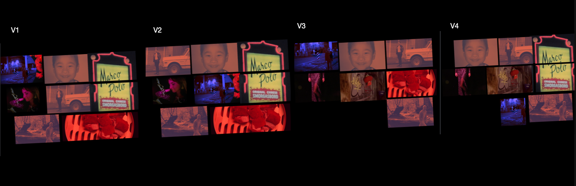
My variations of putting images together
To keep the design consistent I used noise effects and light leaks that would replicate the old photo.
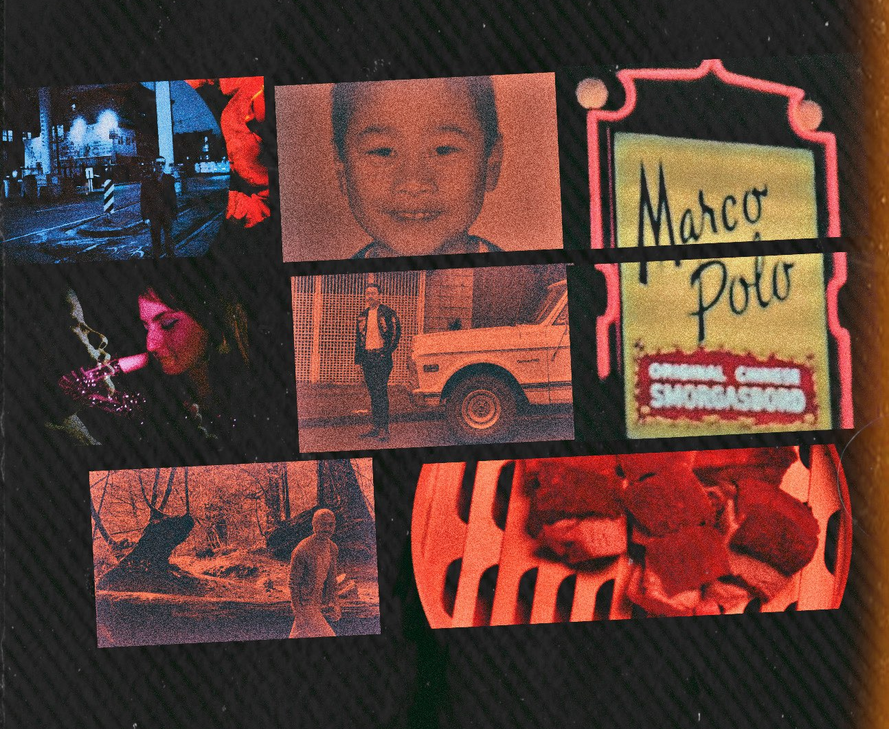
After effects are applied the first version looks more consistent with other thumbnails
For the final version, I added the title of the poem with sponsors' logos on the bottom. I also added who we starred in our film - Jeremy Chu and our team name.
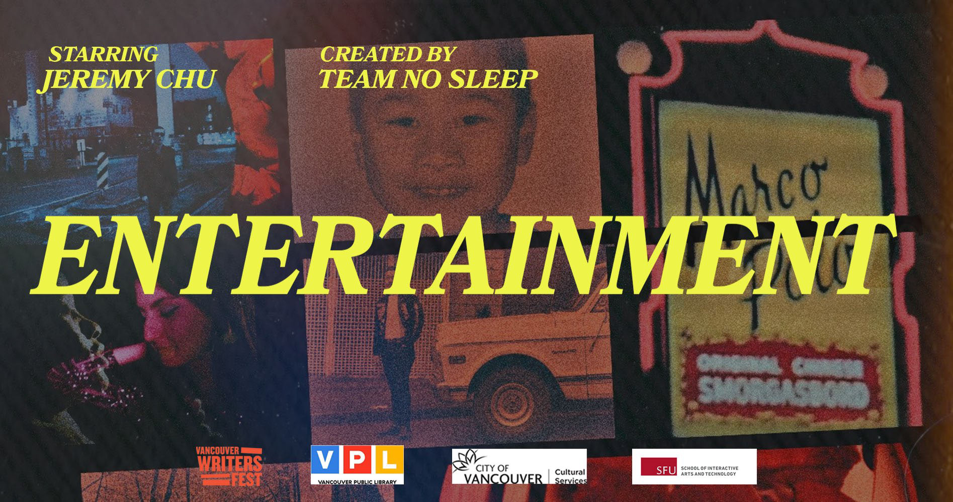
The final version of 3rd thumbnail
Takeaways
It was my first experience working with specified aesthetics, specifically in the 70s. I was always interested in more modern approaches to designs - minimalistic and simplified. Aside from working on thumbnails, it was great to see how my assistance in placing props and lights helped in enhancing the images of the video poem. When I was creating a scene that later is used in the thumbnail "Diaspora" I could not anticipate it will turn out so well and fit the aesthetics perfectly.
The link to the combined video poem and response: Entertainment
Collaborated with Kayla Canama, Tingting Liu, Andrea Huang